Designing the ImpossibleO design do impossívelLe design de l’impossible

In order to celebrate the imminent launch of Impossível como nunca ter tido um rosto (Impossible like never having had a face), poet Ricardo Aleixo’s new book (more information about the event in the flyer above), there follows some words about much of what nurtured the editorial design work I have done.
When Ricardo Aleixo hired me to accomplish this task, he pointed out exactly that he wanted me to give his book its face. This request guided me throughout all the work, and finally I ended up presenting not only one, but two faces.
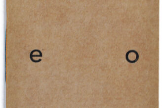
Faces are symmetrical in appearance. But we know that one half never corresponds exactly to the other one. Thus, I explored the symmetry of the open book-object in order to evidence the dissonant symmetry obtained through the juxtaposing of the poet’s series of visual works “As únicas coisas” (The Only Things): one page presents the image in positive, while the other, in negative. The mirroring of the images that scenographically and orchestrally open and close the sections of the book, made in order to obtain the aforementioned symmetry, allowed me to arrive at interesting compositions, especially while connecting the lines/threads (a constant throughout all the artist’s work in diverse media) used in his work. As in the first poem of the book, the face “unfolds into many others”.


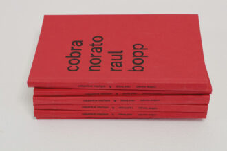
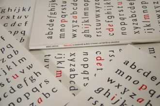
The successive reprints of Impossível como nunca ter tido um rosto will be divided into two graphic series. The book is typeset in Paideuma, a multiform typeface family designed by myself. The family contains three styles: Baroque (a serif design, used for the poems), Concretist (a sans serif used for titles and where the texts are in prose) and Tropicalist (a hybrid italic that can be used in combination with the two other designs). The intention is to make one graphic series presenting a particular arrangement of images and typography, and another one whose (typo)graphic arrangement is inversed: where one font was being used for a role – poems – it will be used to perform another one – prose and titles. This inversion will also take place through the passage from positive to negative of the mirrored images. Thus, in the series number 2, the left page will contain the negative image, while the right page will display the positive one. This principle will also be applied to the covers. In the colophon the number of the series is indicated, and the poet himself will sign each copy of the book.

Overview of of the lowercase letters of Paideuma, a multiform typeface family.

Covers of graphic series number 1 and two.
The typesetting system elaborated, as well as the system of the typeface family itself, responds positively to this inversion. Hence, besides giving another unfoldment to the face of the book, we penetrate still into a domain whose affirmation on the visual and graphic fields is higher – and most importantly, the poems themselves remain intact and in the foreground. There are multiple possibilities of interpreting the poetry of this very gesture, since the book-object ends up signifying by itself its own content.
Finally, the paradox lying behind the intention of systematizing so much pulsation and tension does not refer to an impossibility of design, but rather to designing the impossible. The face, apparently tied, struggles for its affirmation, which is reached through this very process. To me, one important lesson remains: the impossible may nonetheless be feasible. Or, in etymologic terms, poetic.
NB: The photographs contained in this post were taken by Ricardo Aleixo and they represent the proofs of the book, not the final product. The remaining images were digitally produced by myself. As soon as I receive the finished book, I will dedicate to it an updated page on this website.
Para celebrar o lançamento iminente de Impossível como nunca ter tido um rosto, novo livro de poemas de Ricardo Aleixo (informações sobre o evento no convite acima), seguem algumas palavras sobre muito do que alimentou o trabalho de design editorial que eu realizei.
Quando Ricardo Aleixo me contatou para que eu cuidasse dessa tarefa, ele me explicitou querer justamente que eu desse ao livro seu rosto. Este pedido me guiou durante todo o trabalho, e no final acabei chegando a não um, mas dois rostos.
O rosto é, em aparência, simétrico. Mas sabemos que uma metade nunca é de fato a correspondência exata da outra. Assim, explorei a simetria do objeto-livro aberto para evidenciar a simetria dissonante que se obtém ao se justapor a série de trabalhos visuais “As únicas coisas”, do próprio poeta: de um lado, em positivo, do outro, em negativo. O espelhamento das imagens que abrem e fecham cenográfica e orquestralmente as seções do livro, feito para se obter a simetria acima mencionada, permitiu que eu chegasse a interessantes composições, especialmente ao juntar as linhas (uma constante em toda a obra multimídia do artista) usadas no seu trabalho. Como no primeiro poema do livro, o rosto “se desdobra em muitos outros”.
As sucessivas tiragens de Impossível como nunca ter tido um rosto serão divididas em duas séries gráficas. O livro é composto em Paideuma, família tipográfica multiforme de minha autoria. A família é dividida em três fontes: Barroco (serifada, usada nos poemas), Concretista (sem serifa, utilizada em títulos e onde o texto é em prosa) e Tropicalista (itálico híbrido que pode ser usado em conjunto com qualquer das duas fontes). A intenção é fazer uma série gráfica com um determinado arranjo de imagens e tipografia, e outra com o arranjo tipográfico invertido: onde uma fonte estava sendo usada para um papel – poemas – ela passará a ser usada para outro – prosa e títulos. A inversão se dará também na positivação/negativação das imagens espelhadas. Assim, na série dois, a página da esquerda conterá a imagem em negativo, e a da direita, em positivo. Esse princípio afetará também a capa. No colofão há o número da série, cujos exemplares serão numerados à mão pelo poeta.
Conjunto de minúsculas de Paideuma, família tipográfica multiforme.
Capas das séries gráficas número 1 e 2.
O sistema de diagramação elaborado, assim como o sistema da família tipográfica em si, responde positivamente a essa inversão. Assim, além de ser dado outro desdobramento ao rosto do livro, adentramos ainda num domínio de maior afirmação no campo gráfico e visual – e o principal, os poemas, intactos e em primeiro plano. As possibilidades de se interpretar a poesia do gesto também são múltiplas, já que o objeto-livro acaba por, si só, a significar seu próprio conteúdo.
Por fim, o paradoxo que reside em sistematizar tanta pulsão e tensão remete não a uma impossibilidade de design, mas ao design do impossível. O rosto, aparentemente amarrado, luta pela sua afirmação, e a alcança no processo em si. Para mim fica uma grande lição: o impossível pode ser, não obstante, factível. Ou, em termos etimológicos, poético.
N.B.: As fotografias contidas neste post são de Ricardo Aleixo e representam as provas do livro, não o produto final. As demais imagens foram produzidas digitalmente por mim. Ao ter o livro finalizado em mãos, dedicarei a ele uma página atualizada neste site.
Pour célébrer la publication imminente de Impossível como nunca ter tido um rosto (Impossible comme n’avoir jamais eu un visage), nouveau recueil de poèmes de Ricardo Aleixo (plus informations de l’évènement sur l’affichette ci-dessus), je vous fais parvenir quelques mots sur beaucoup de ce qui a nourri le travail de design éditorial que j’ai réalisé.
Lorsque Ricardo Aleixo m’a contacté pour que je m’occupe de cette tâche, il a explicité qu’il voulait effectivement que je donne au livre son visage. Cette demande m’a conduit tout au long du travail, et à la fin je suis arrivé à pas seulement un, mais deux visages.
Le visage est, en apparence, symétrique. Mais nous savons qu’une moitié n’est jamais réellement la correspondance exacte de l’autre. Ainsi, j’ai exploré la symétrie de l’objet-livre ouvert pour mettre en évidence la symétrie dissonante que l’on obtient en juxtaposant la série de travaux visuels « As únicas coisas » (Les uniques choses), du poète lui-même : d’un côté, en positif, de l’autre, en négatif. La mise en miroir des images qu’ouvrent et ferment de façon scénographique et orchestrale les sections du livre, faite afin d’obtenir la symétrie mentionnée ci-dessus, m’a permis d’arriver à des intéressantes compositions, spécialement en rejoignant les lignes/fils (une constante tout au long de l’œuvre multimédia de l’artiste) utilisées dans son travail. Comme dans le premier poème du livre, le visage « se déplie en plusieurs autres. »
Les tirages successifs de Impossível como nunca ter tido um rosto seront divisés en deux séries graphiques. Le livre est composé en Paideuma, famille typographique multiforme dont je suis le designer. La famille comprend trois styles: le Baroque (caractère à empattements, utilisé pour les poémes), le Concrétiste (linéale utilisé pour les textes en prose) et le Tropicaliste (italique hybride qui peut être utilisé en combinaison avec les deux autres fontes). L’intention est de faire une série graphique avec une disposition particulière d’images et typographie, et l’autre avec la présentation inversée : où une fonte était utilisé pour un rôle – poèmes – elle sera utilisée pour un autre – prose et titrage. Cette inversion a lieu aussi dans la mise en positif/negatif des images en miroir. Ainsi, dans la série 2, la page à gauche contiendra l’image en négatif, tandis que la page à droite la contiendra en positif. Ce principe affectera aussi la couverture. Dans le colophon il y a l’indication du numéro de la série, dont les exemplaires seront numérotés à la main par le poète.
Aperçu du bas-de-casse de Paideuma, famille typographique multiforme.
Couvertures des séries graphiques numéro 1 et 2.
Le système de mise en pages projetée, ainsi que celui de la famille de caractères en soi, répondent positivement à cette inversion. Ainsi, en plus de donner un autre dépliage au visage du livre, nous rentrons encore dans un domaine ayant une plus grande affirmation dans le champ graphique et visuel – et ce en gardant le plus important, les poèmes, intacts et au premier plan. Les possibilités d’interpréter la poésie de ce geste sont aussi multiples, une fois que l’objet-livre lui-même finit par signifier son propre contenu.
Finalement, le paradoxe qui réside dans la systématisation d’autant de pulsion et tension ne remonte pas à une impossibilité de design, mais plutôt au design de l’impossible. Le visage, apparemment attaché, lutte néanmoins pour son affirmation, et l’atteint dans le processus lui-même. Pour moi, il reste une importante leçon : l’impossible peut être cependant faisable. Ou, en termes étymologiques, poétique.
N.B. : Les photographies dans ce post ont été prises pas Ricardo Aleixo et représentent les épreuves du livre, et non le produit final. Les autres images ont été produites numériquement par moi-même. Dès que j’aurai reçu le livre finalisé, je lui consacrerai une page mise à jour sur ce site.