ScotchScotchScotch

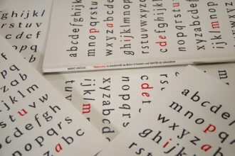
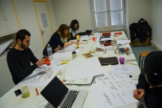
Alphabet conceived for the typographic installation of the exhibition organized in the workshop with the designers from Change is Good. Applying in the space letters created with 5 cm width adhesive tape, the words perform a game among the false friends from the students’ native languages. While transposing this concept to the type design field, I have created a typeface whose letters are decomposed in four fonts/layers. Its manipulation allows for a wide array of chromatic interactions.


Alfabeto concebido para a instalação tipográfica da exposição realizada a partir do workshop com os designers Change is Good. Com letras criadas com fitas adesivas coloridas de 5 cm de largura, foi encenado um jogo entre os falsos cognatos das línguas nativas dos estudantes. Transpondo o conceito para o design de tipos digitais, criei um tipo cujas letras têm os traços decompostos em quatro fontes/camadas, cuja manipulação permite uma vasta gama de interações cromáticas.
Alphabet conçu pour l’installation typographique de l’exposition réalisée dans un workshop avec les designers de Change is Good. En utilisant des lettres créées avec du scotch coloré de 5 cm de largeur, on a mis en scène un jeu parmi les faux-amis des langues maternelles des étudiants. En transposant ce concept au dessin de caractères numériques, j’ai créé une police dont les lettres sont décomposées en quatre fontes, dont la manipulation permet l’obtention d’une vaste gamme d’interactions chromatiques.